Dolby Atmos Application
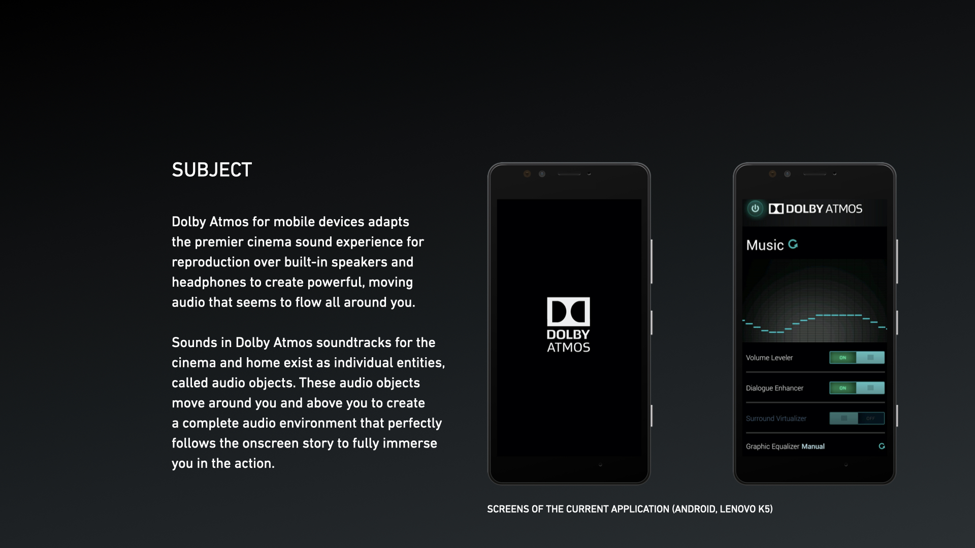
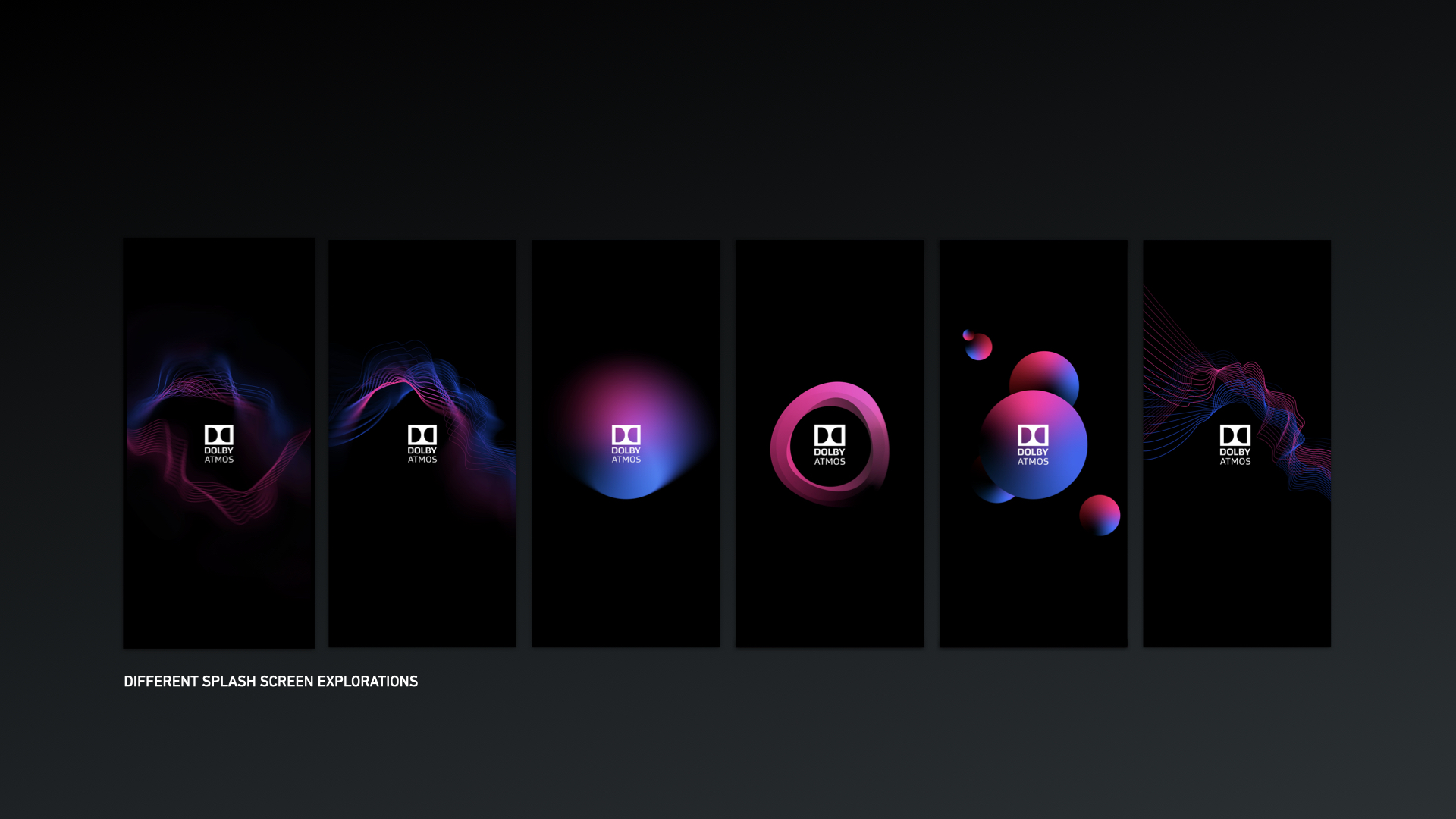
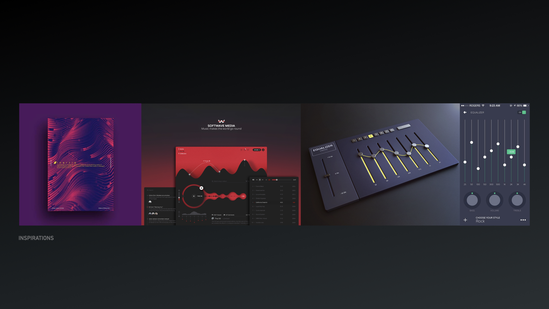
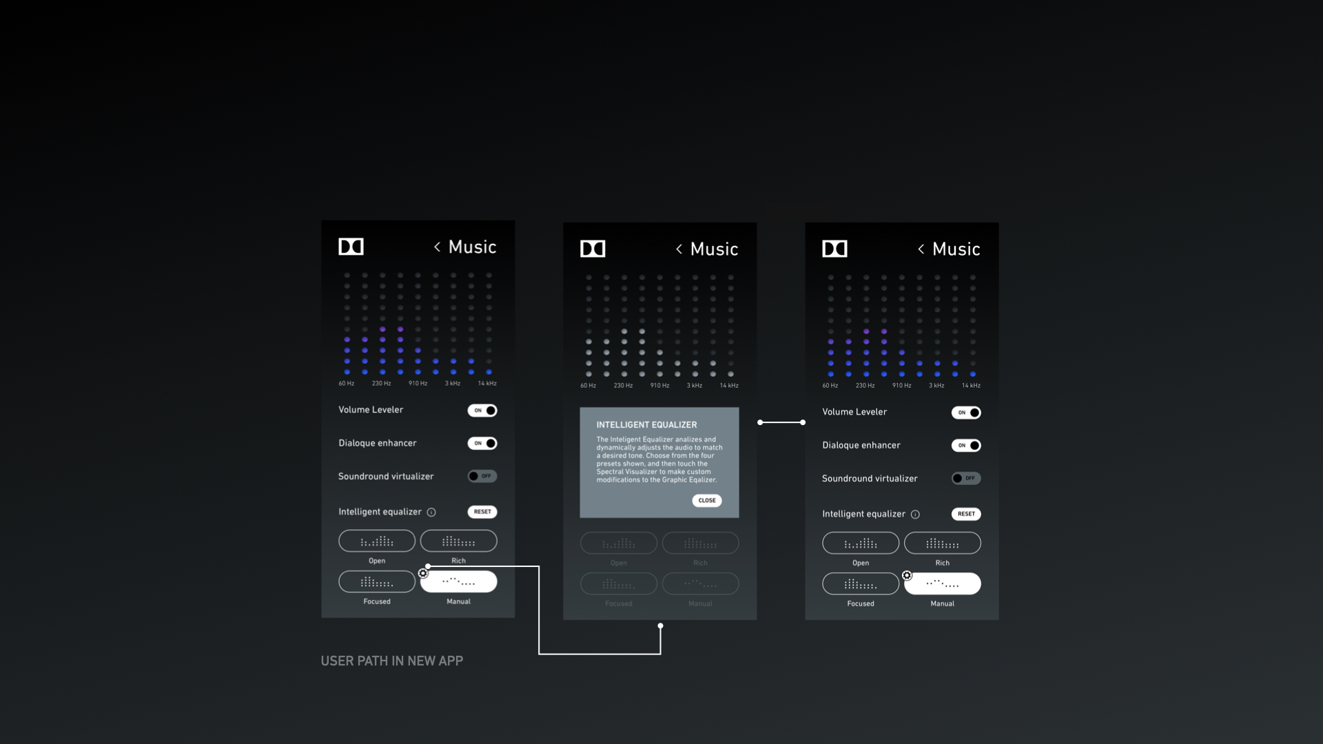
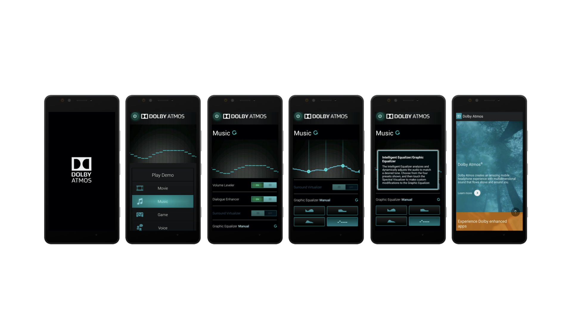
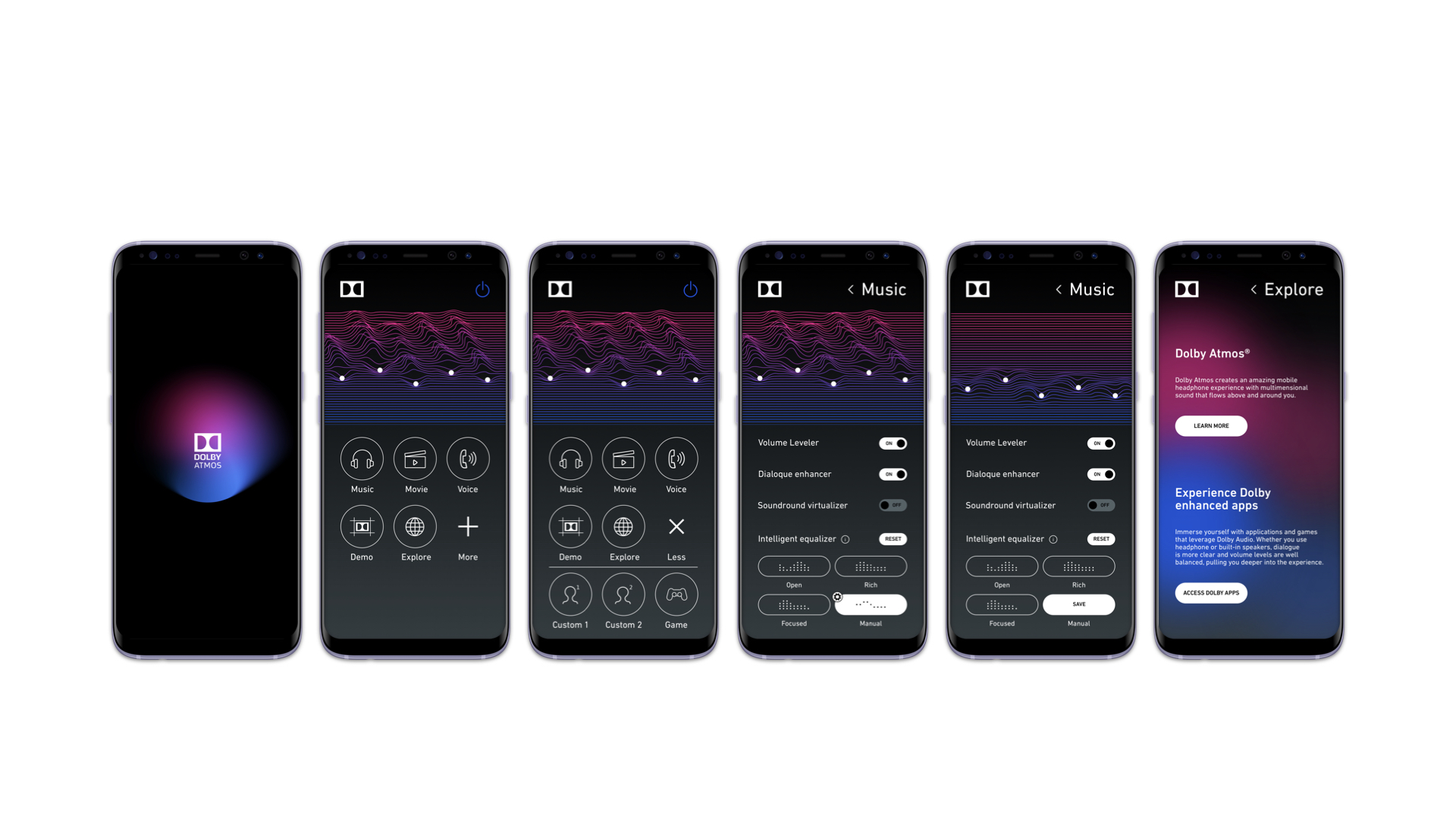
The project involved the redesign of the Dolby Atmos mobile application to achieve a more modern and user-friendly interface. As part of a development exercise, the new design focused on enhancing the overall user experience by incorporating contemporary aesthetics and streamlined navigation. The updated application aimed to reflect Dolby's commitment to innovation while making advanced audio technology more accessible to users.
UX/UI: Kornelia Stronska
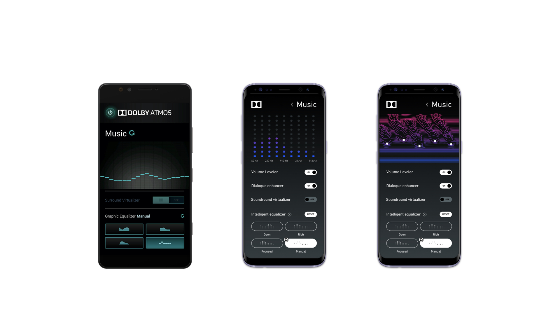
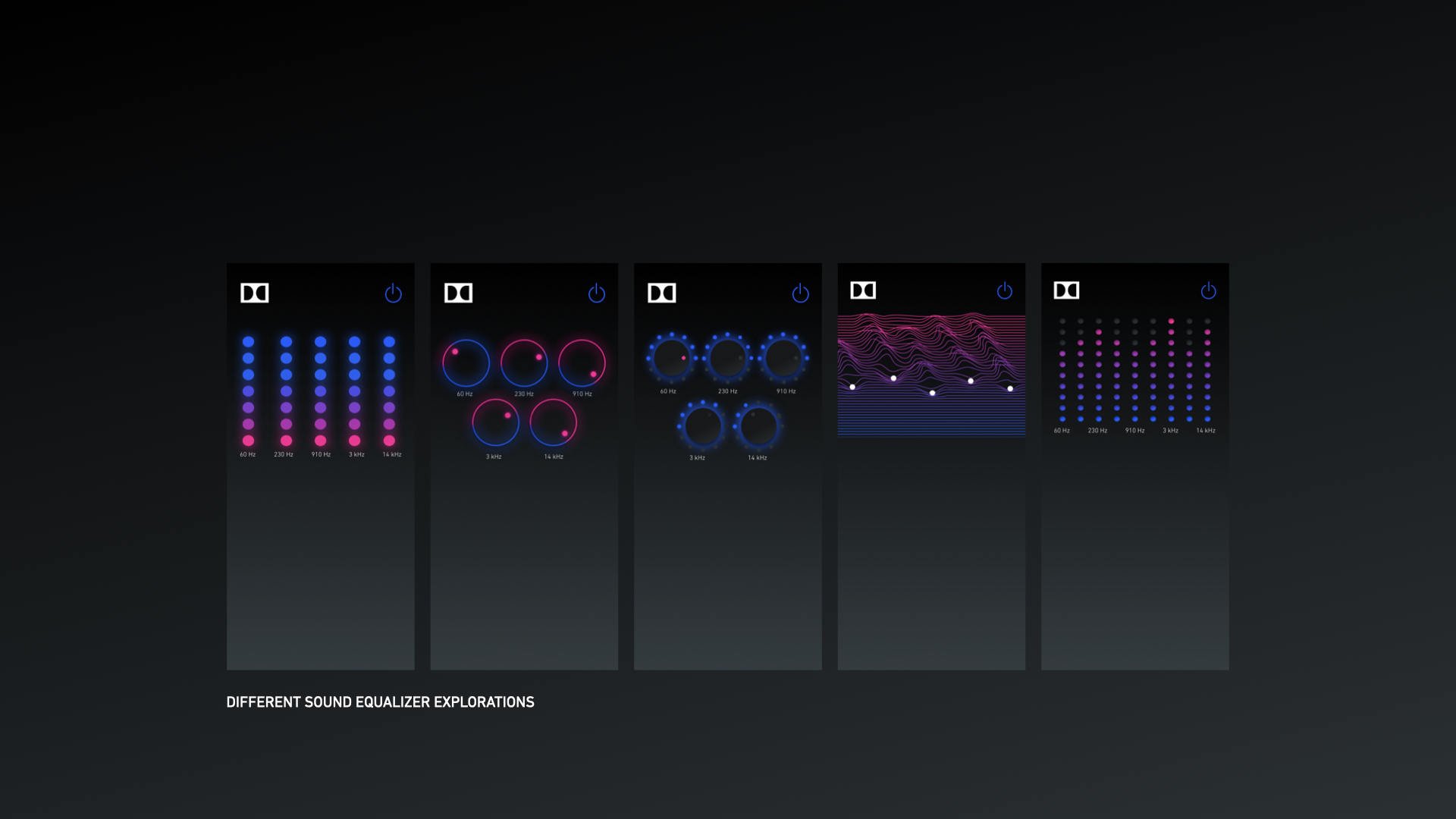
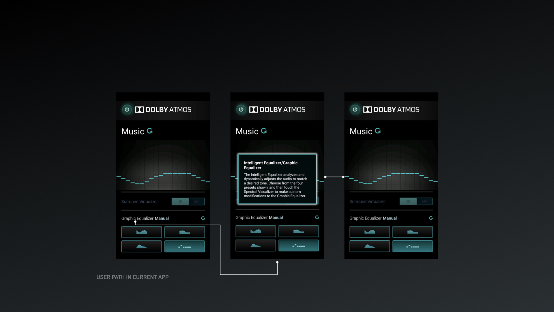
On the left, old screen before redesign. On the right, two different versions of the sound equalizer. Screen at the middle was used for the application prototype.

